College Sauce
Role
Designer
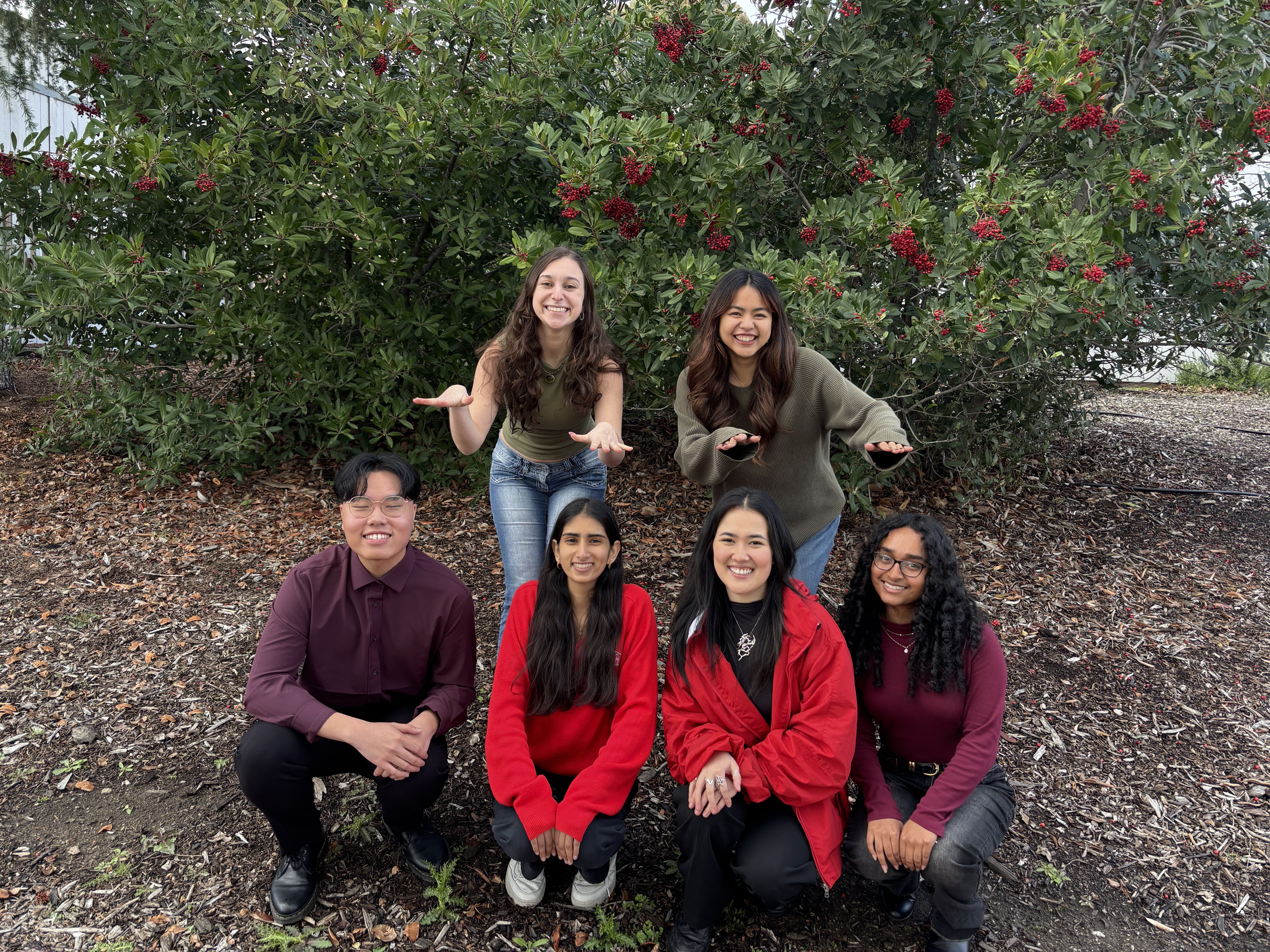
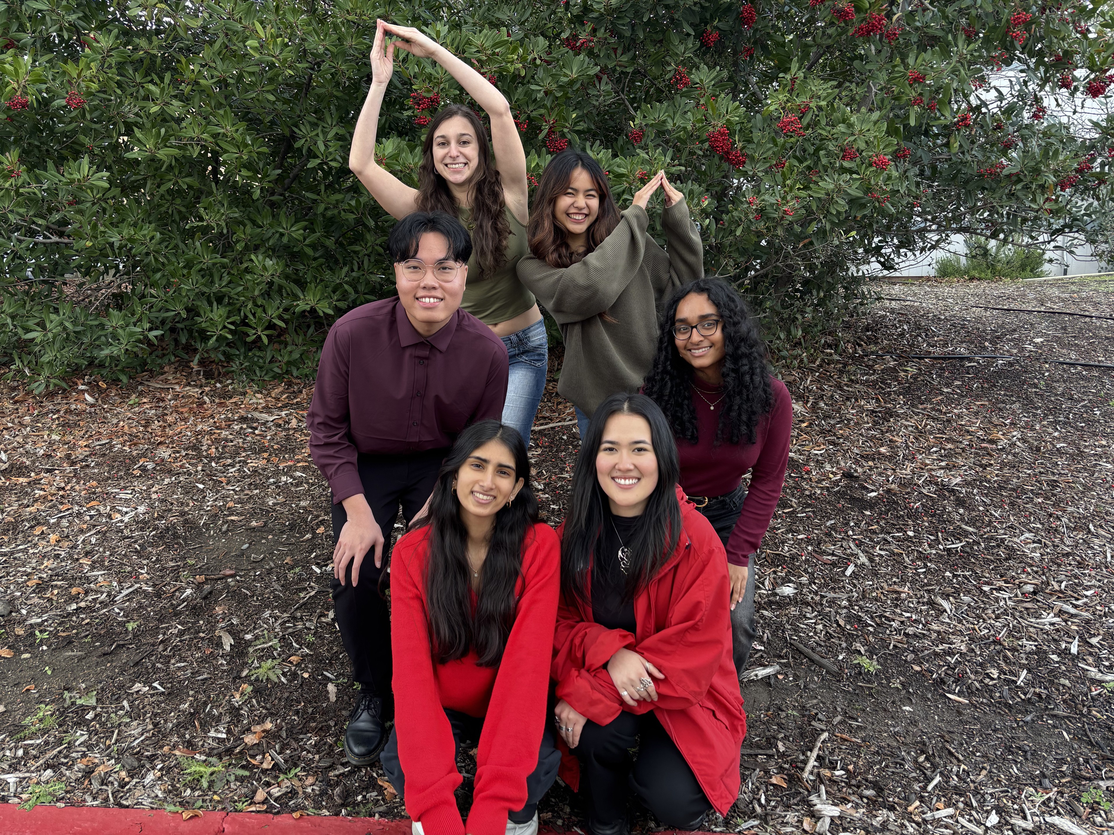
TEAM
2 Project Managers:
Maxine Ancheta
Sophia Levin
4 Designers:
Xouxa Latendresse
Edrick Wong Liang
Pavani Balaji
Subha Eranki
DURATION
January 2025 – March 2025
Tools
FigJam
Figma
Notion
Google Surveys
SKILLS
UX Research
Application Concepting
1-1 Interviewing
Prototyping
Interaction Design
Branding
. ݁₊ ⊹ . ݁ ⟡ ݁ . ⊹ ₊ ݁.
College Sauce
Role
Designer
DURATION
January 2025 – March 2025
SKILLS
UX Research
Application Concepting
1-1 Interviewing
Prototyping
Interaction Design
Branding
TEAM
2 Project Managers:
Maxine Ancheta
Sophia Levin
4 Designers:
Xouxa Latendresse
Edrick Wong Liang
Pavani Balaji
Subha Eranki
Tools
FigJam
Figma
Notion
Google Surveys
. ݁₊ ⊹ . ݁ ⟡ ݁ . ⊹ ₊ ݁.
College Sauce
Role
Designer
TEAM
2 Project Managers:
Maxine Ancheta
Sophia Levin
4 Designers:
Xouxa Latendresse
Edrick Wong Liang
Pavani Balaji
Subha Eranki
DURATION
January 2025 – March 2025
Tools
FigJam
Figma
Notion
Google Surveys
SKILLS
UX Research
Application Concepting
1-1 Interviewing
Prototyping
Interaction Design
Branding
. ݁₊ ⊹ . ݁ ⟡ ݁ . ⊹ ₊ ݁.
CONTEXT
College Sauce is a social networking app designed “by students, for students,” started at UC Santa Barbara and serving over 10,000 college students. The application aims at getting students in the know of current events, on and off campus. Essentially, serving as a digital hub for university life, combining elements of a social calendar, messaging platform, and local guide into one student-centered application. As a real client of Cal Poly’s design agency, Iter8, we redesigned the mobile application in an eight-week timeframe.
PROBLEM
PROBLEM
PROBLEM
01
Visual Clutter & Inconsistency
The interface suffers from visual overload, inconsistent alignment, and spacing issues, creating a high cognitive load that makes it difficult to scan content.
01
Visual Clutter & Inconsistency
The interface suffers from visual overload, inconsistent alignment, and spacing issues, creating a high cognitive load that makes it difficult to scan content.
01
Visual Clutter & Inconsistency
The interface suffers from visual overload, inconsistent alignment, and spacing issues, creating a high cognitive load that makes it difficult to scan content.
02
Discovery & Navigation Friction
Users face significant barriers to finding content due to the absence of a global search bar, restrictive filtering logic, and imprecise map interactions.
02
Discovery & Navigation Friction
Users face significant barriers to finding content due to the absence of a global search bar, restrictive filtering logic, and imprecise map interactions.
02
Discovery & Navigation Friction
Users face significant barriers to finding content due to the absence of a global search bar, restrictive filtering logic, and imprecise map interactions.
03
Ambiguous System Feedback
The application fails to communicate system state effectively, lacking critical feedback loops such as loading states, error messages, or clear confirmations.
03
Ambiguous System Feedback
The application fails to communicate system state effectively, lacking critical feedback loops such as loading states, error messages, or clear confirmations.
03
Ambiguous System Feedback
The application fails to communicate system state effectively, lacking critical feedback loops such as loading states, error messages, or clear confirmations.
04
Functional & Personalization Gaps
Core usability is compromised by non-responsive elements and a lack of personalization options for user profiles.
04
Functional & Personalization Gaps
Core usability is compromised by non-responsive elements and a lack of personalization options for user profiles.
04
Functional & Personalization Gaps
Core usability is compromised by non-responsive elements and a lack of personalization options for user profiles.
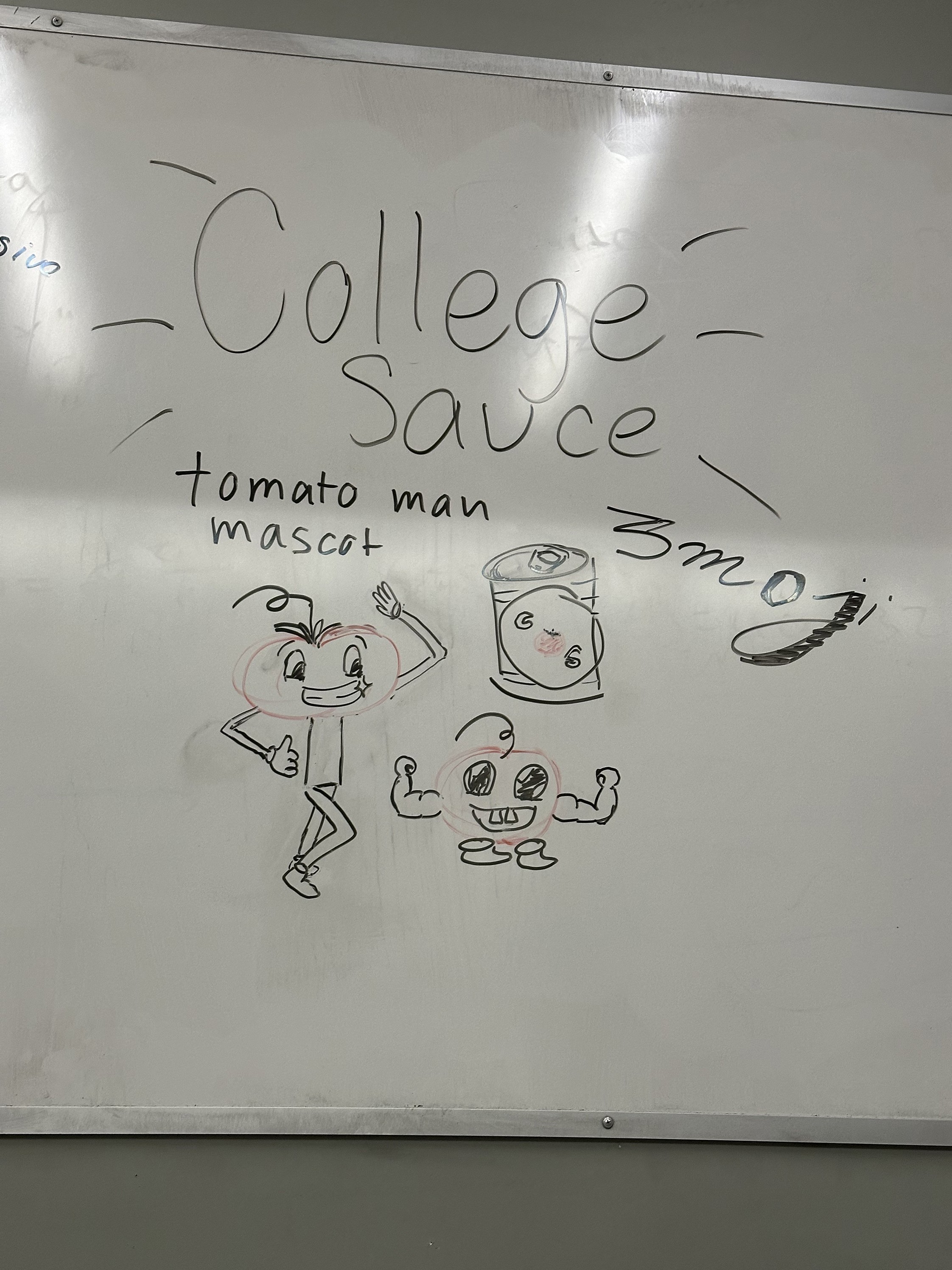
SOLUTION
The project solution is a redesigned mobile application prototype, alongside a company brand revamp: logo, color palette, and mascots.
SOLUTION
The project solution is a redesigned mobile application prototype, alongside a company brand revamp: logo, color palette, and mascots.
SOLUTION
The project solution is a redesigned mobile application prototype, alongside a company brand revamp: logo, color palette, and mascots.

CLIENT RESEARCH
The first step in our methodology was to assess the health of the current application to serve as the foundation for our redesign strategy.
We conducted a comprehensive heuristic evaluation to identify existing errors within the interface, flagging inconsistencies in the design system and logic errors in the navigation.


Lack of Visuals: no images showcasing what the event is for users who want to quickly scanning the events in their area.
No Hierarchy: The large amounts of grey text cause reading fatigue, which makes users want to stop reading. The header sentence is too close in size to the body copy.
No Sub Sections: Reading the event text and bullet points looks unprofessional.
Get Directions: This is a good feature, but it does not account for people who want to attend event in the future and need to save the info.
Filters: no way to filter and select which event type you want - tab automatically closes once one event type is selected
Date Range: only shows ‘Today’ and ‘This week’ no way to select specific dates
Clubs tab: Drop down menu is greyed out when switching to the clubs tab - doesn’t lead anywhere just takes up space
Cluttered Layout: visual overload of elements in a single view, confuses users when trying to navigate app
Inconsistent Alignment: The buttons located near the search bar are not aligned to the defined margins
Unclear CTA: Users may struggle to identify what their primary action should be
Icon Clarity: The event icons do not clearly represent their event

Lack of Visuals: no images showcasing what the event is for users who want to quickly scanning the events in their area.
No Hierarchy: The large amounts of grey text cause reading fatigue, which makes users want to stop reading. The header sentence is too close in size to the body copy.
No Sub Sections: Reading the event text and bullet points looks unprofessional.
Get Directions: This is a good feature, but it does not account for people who want to attend event in the future and need to save the info.
Filters: no way to filter and select which event type you want - tab automatically closes once one event type is selected
Date Range: only shows ‘Today’ and ‘This week’ no way to select specific dates
Clubs tab: Drop down menu is greyed out when switching to the clubs tab - doesn’t lead anywhere just takes up space
Cluttered Layout: visual overload of elements in a single view, confuses users when trying to navigate app
Inconsistent Alignment: The buttons located near the search bar are not aligned to the defined margins
Unclear CTA: Users may struggle to identify what their primary action should be
Icon Clarity: The event icons do not clearly represent their event
COMPETITIVE ANALYSIS
Students currently rely on a patchwork of disconnected apps to manage their social lives so we analyzed competitors to understand how they handle things like verification and discovery. Our analysis revealed a clear gap: while each competitor solves one specific problem, none offered a more unified ecosystem for the entire student experience.

QUANTITATIVE RESEARCH & SURVEY
To gain an understanding of how college students find, engage, and connect through events, we sent out a Google Survey.
Our research focused on three main areas:
Event preferences: What type of events students are most interested in
Event discovery & Search Methods: How they currently find events and what tools they want
Social connectivity: How they connect with other students before or after an events
0
0
Students Surveyed
Predominantly of which were Cal Poly students (~83%)
0
0
Students Surveyed
Predominantly of which were Cal Poly students (~83%)
0
0
Students Surveyed
Predominantly of which were Cal Poly students (~83%)
0%
0%
Considered somewhat involved
0%
0%
Considered somewhat involved
0%
0%
Considered somewhat involved
0%
0%
Communicate via text or SNS
0%
0%
Communicate via text or SNS
0%
0%
Communicate via text or SNS
QUANTITATIVE FINDINGS
Main findings:
Students prefer event preferences such as live performances, social events, and hobby-based activities
They want filters, personalized recommendations, and popularity indicators to find events
Users are looking for calendar integration and reminders to keep track of events
Most connect through text & social media
Implementation:
Enhanced filtering (by category, time, price, color-coded, multi-tagging)
Event popularity indicators (friends in attendance, marker)
Calendar similarity and live status
Social features, profiles, chats, networking)
Implementation:
Enhanced filtering (by category, time, price, color-coded, multi-tagging)
Event popularity indicators (friends in attendance, marker)
Calendar similarity and live status
Social features, profiles, chats, networking)
Implementation:
Enhanced filtering (by category, time, price, color-coded, multi-tagging)
Event popularity indicators (friends in attendance, marker)
Calendar similarity and live status
Social features, profiles, chats, networking)
QUALITATIVE RESEARCH & INTERVIEWS FINDINGS
We additionally conducted 11 face-to-face user interviews to understand how college students find out about and engage with events on and off campus
We focused on providing us insights on the pain points and challenges students face when choosing events and the dynamics of connecting with peers at social events.

AFFINITY MAPPING
After transcribing the interviews, we deconstructed the results and interview feedback into individual data or pain points and clustered them to find possible patterns.
From this, we developed new features to fill user experience gaps.
AFFINITY MAPPING
After transcribing the interviews, we deconstructed the results and interview feedback into individual data or pain points and clustered them to find possible patterns.
From this, we developed new features to fill user experience gaps.
AFFINITY MAPPING
After transcribing the interviews, we deconstructed the results and interview feedback into individual data or pain points and clustered them to find possible patterns.
From this, we developed new features to fill user experience gaps.

User Personas
In analyzing user research and affinity mapping, I developed four main user personas that best embodied the target audience’s goals and frustrations.
User Personas
In analyzing user research and affinity mapping, I developed four main user personas that best embodied the target audience’s goals and frustrations.
User Personas
In analyzing user research and affinity mapping, I developed four main user personas that best embodied the target audience’s goals and frustrations.


Problem Statement & How Might We
Problem Statement & How Might We
Problem Statement & How Might We

User flow: old vs new
To drive user acquisition and promote user-generated content, we completely restructured the information architecture, adding new features to promote trust and discoverability.
Our client and user research and audit revealed possibly why the original user flow often led to dead ends: users would open the app, fail to find relevant content, and leave. The Google survey and user interviews confirmed why: the experience was filled with barriers to connection and the app needs to be map-centric, making events and interactions primarily discovered through the map. Additionally, students feel hesitant to commit to events without social proof, struggling to discover relevant communities, and lacking the tools to build a trustworthy and personalized digital identity.
Old USER FLOW
New USER FLOW

Old USER FLOW
New USER FLOW
Old USER FLOW
New USER FLOW
KEY CHANGES
KEY CHANGES
KEY CHANGES
Event Discovery & Encouragement
Users can now vet an event via “Vibe Check,” attendance lists, and venue photos before committing. Receiving a sticker after attending, possibly encouraging overall attendance.
Event Discovery & Encouragement
Users can now vet an event via “Vibe Check,” attendance lists, and venue photos before committing. Receiving a sticker after attending, possibly encouraging overall attendance.
Event Discovery & Encouragement
Users can now vet an event via “Vibe Check,” attendance lists, and venue photos before committing. Receiving a sticker after attending, possibly encouraging overall attendance.
Community Findings
User can search specifically for Group Chats or have them automatically added based on their major, clubs, or courses.
Community Findings
User can search specifically for Group Chats or have them automatically added based on their major, clubs, or courses.
Community Findings
User can search specifically for Group Chats or have them automatically added based on their major, clubs, or courses.
Profile Building
The profile is now a destination in itself. With Scrapbooks and stickers, it encourages users to curate their identity. While mutuals, courses lists, and linked socials act as social proof.
Profile Building
The profile is now a destination in itself. With Scrapbooks and stickers, it encourages users to curate their identity. While mutuals, courses lists, and linked socials act as social proof.
Profile Building
The profile is now a destination in itself. With Scrapbooks and stickers, it encourages users to curate their identity. While mutuals, courses lists, and linked socials act as social proof.
LOW FIDELITY
As a team we wanted to centralize the map as the main landing point for a hub of events, mainly highlighting upcoming ones. Additionally, we determined a bright color palette would be ideal for this product concept.
After competitive analysis, I thought of a pull up catalog to list the rest of the events, listed by categories and with horizontal scrolling can quickly view more events. I explored the idea of a "hot" marker or a hot map for areas where theres a high number of large social gatherings. With our qualitative research results, I expanded filters to be personalizable and created the structure of a listed version of upcoming events, instead of the map. Additionally, using my experience with the Disability Resource Center at Cal Poly, I introduced the idea of accessibility filters. The information hierarchy and design of the event card was done by another designer, I added the interaction element.


MID FIDELITY
Beginning this phase, copy was written and images were placed.
During this phase, I tested different ways to look up users, the use of icons, and informations hierarchy of cards. As well, my project managers determined the tag colors, I implemented these as the quick tags for event category to preview upcoming events. Further, the medium event card for the list format was created with a clearer snapshot of the event.


BRANDING & DESIGN SYSTEM
We developed a design system based on our research insights and client input.
User interviews revealed that many found the original branding uninspired and outdated. To address this, we introduced a bright, fresh, and inspiring color palette that enhances engagement and visual appeal.

FINAL SCREENS
FINAL SCREENS
FINAL SCREENS
Live Explore Map
Location based explore page, to learn where events will take place with a pull up catalog of categorized events. Access filters, main tags, and search bar in one-click.


List View of Events
Switch to a calendar list view of events. To quickly scan event details such as time, location, mutual friends in attending, and category.
Expanded Filters
Find specific upcoming events by price, date, location, popularity (RSVP Rate), and accesibility parameters.


Sauce Map!
Get saucy and easily view hot areas. Find hot social events like parties concerts and other large gatherings.
REFLECTIONS
First time in a design agency.
Being my first time in the agency, it was my first time in a group project for a client. I had no clue what I was embarking on, however I learned a lot on how to communicate to my design leads and within a team. Being in the agency meant working with peers outside of my major as both design leads had graphic design backgrounds, emphasizing and highlighting the importance of different perspectives and skillsets.
The importance of proper layers and auto-layout.
Being one of my first serious projects in Figma, I was still learning how to use auto-layout and just how to generally design in Figma. When it came to prototyping, I had to redo certain layouts due to how improperly I grouped and auto-laid out elements. Therefore, after this project, I learned the importance of taking my time during the early stages of the design process to successfully set myself up for prototyping.
Learning how to design for a mobile application.
This was my first time designing for a mobile application, prior to this, I only had experience in designing for desktop. And I quickly realized how less white space there was to visualize and display information and therefore had to be strategic by using collapses and motion, in this case mostly horizontal scrolls. I learned how useful collapsing elements and icons can be to properly aid users in completing the end goal: finding events or getting saucy!
THE FUTURE
THE FUTURE
THE FUTURE
Application & Branding Implementation
The high-fidelity prototype is now in the hands of the client’s development team for implementation. Alongside the screens and flows, we delivered a comprehensive Design System to serve as the foundation for the applications’ future expansion. Whether the company chooses to implement the full redesign immediately or incrementally adopt specific components (e.g., Vibe Check or new Events Cards), the system and files ensures consistency.
Testimony from Sarah Boggs, CEO of College Sauce
“The Cal Poly Iter8 team is nothing short of amazing. My company, ‘College Sauce’ was chosen to be one of their quarter long design projects and from the very first meeting, until the last, I was impressed with the professionalism, skills, creativity and commitment of the entire team. They did a copious amount of work in a relatively short amount of time and delivered a completely re-branded and redesigned app at the end of the engagement. They were engaged, thoughtful, and they delivered! I will be using their designs as we re-brand and add features to our app. If you have the opportunity to use the services iter8 provides, don’t pass it up. If you are interested in any of these team members as employees, don’t hesitate to hire them. They have proven to be professional designers with top notch skills.”